

SOY SAUCE DISPENSER DESIGN CONCEPT
This project is independently developed by the Class A Solution team and completely unassociated with Kikkoman Corporation.
Challenge
Redesign the iconic Kikkoman soy sauce packaging.
Solution
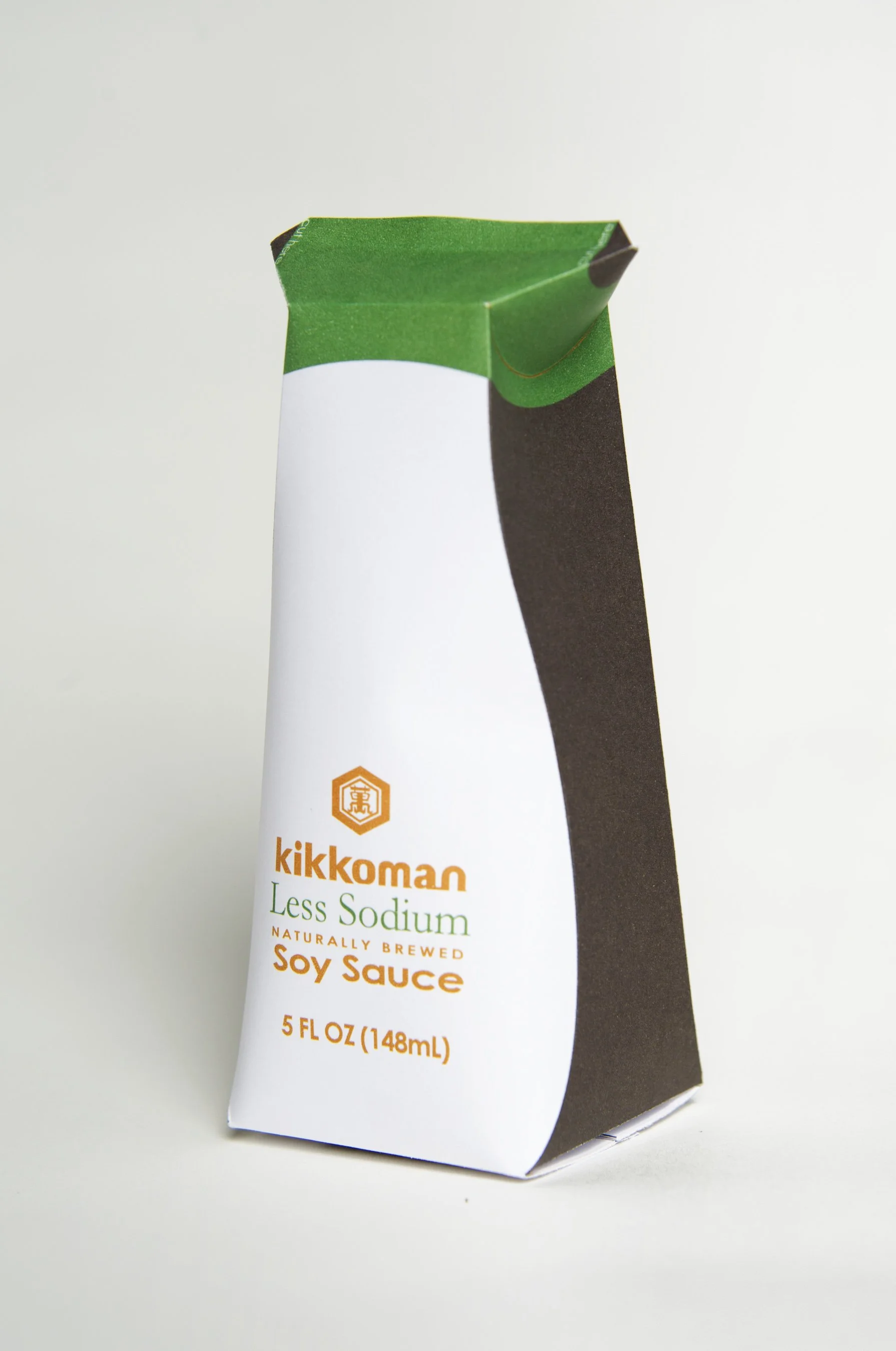
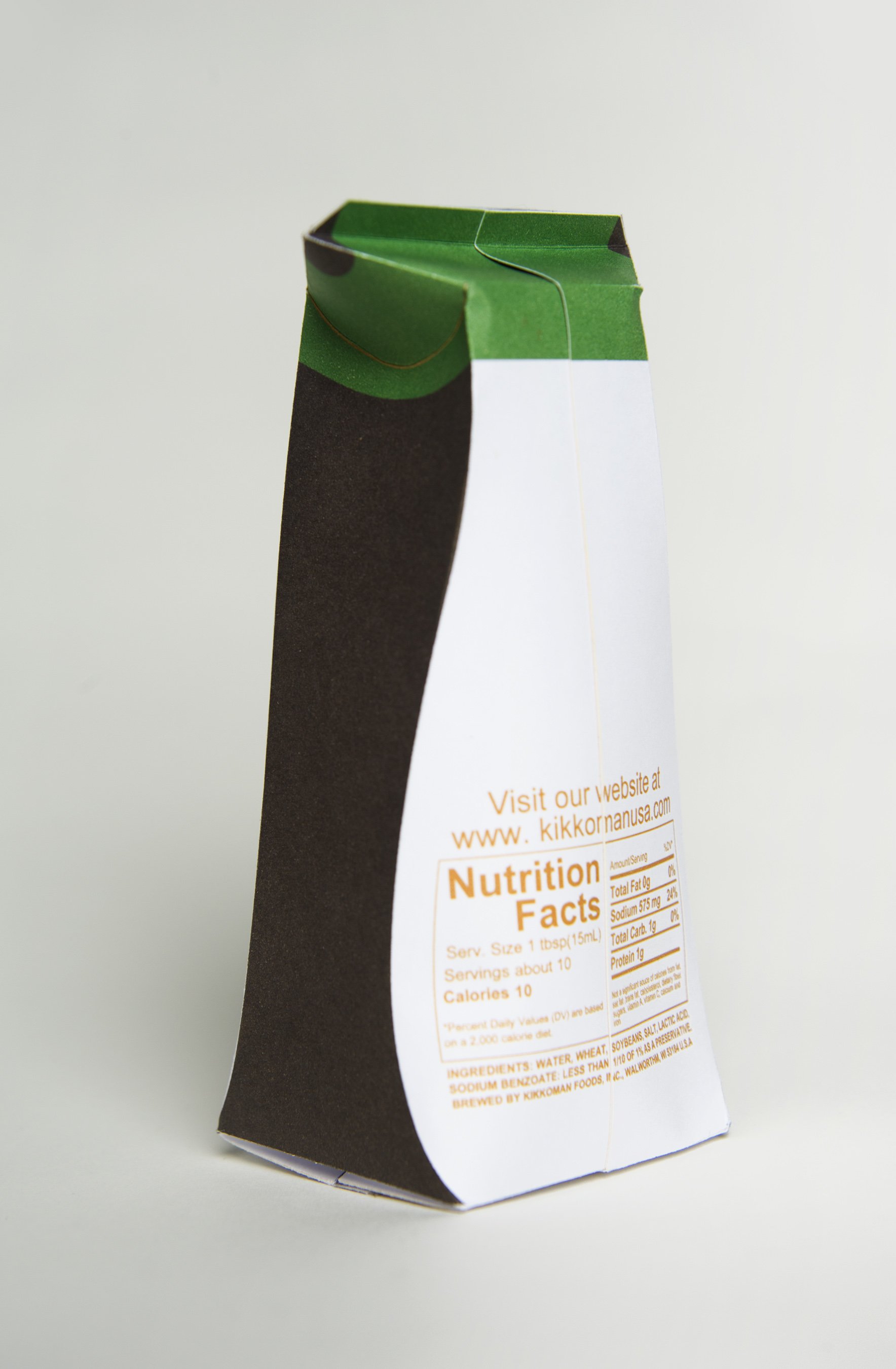
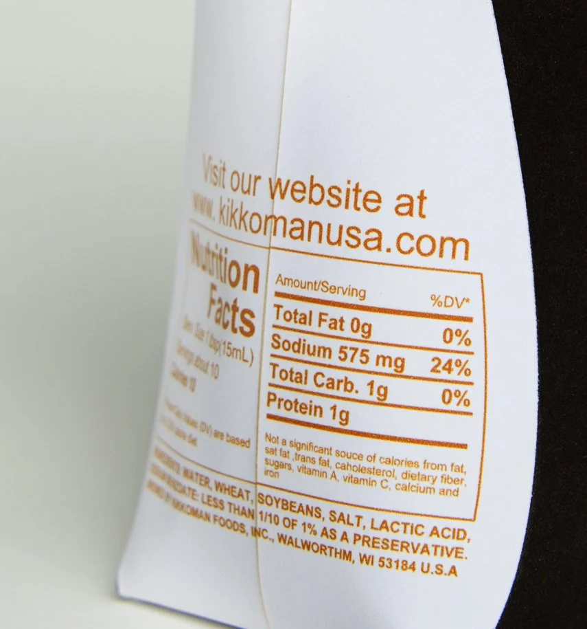
An aseptic package for Kikkoman that differentiates the brand from competitors on shelves, reduces shipping weight, and still keeps its existing design language.
A CLASSIC SILHOUETTE
Featuring a curved silhouette and unobtrusive lettering, the bottle’s simplicity, elegance and modernity make it a genuinely attractive object. The trendy designer bottle beautifies tables in homes and restaurants the whole world over. It has a perfectly shaped pourer for the precise and clean dispensing of small quantities or even single drops of soy sauce without drips.
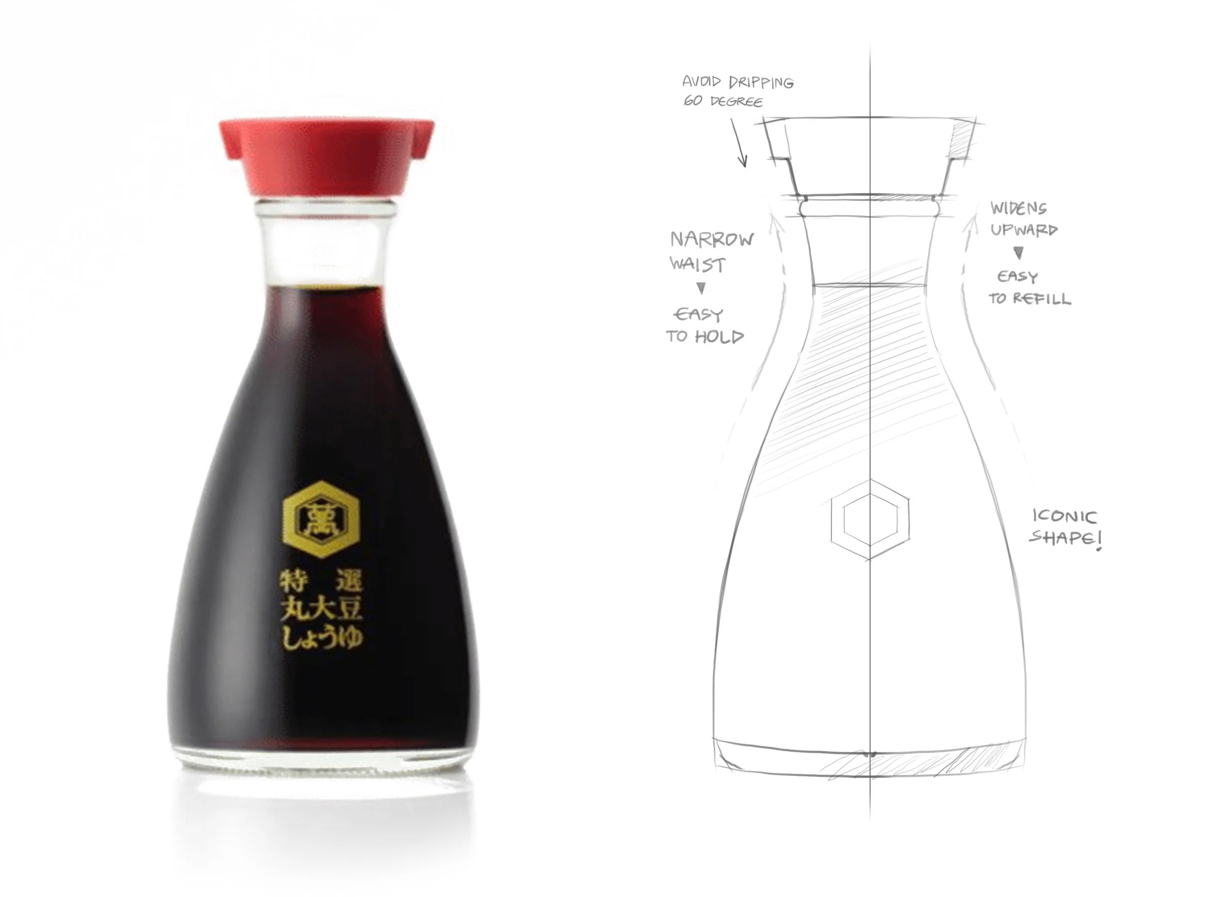
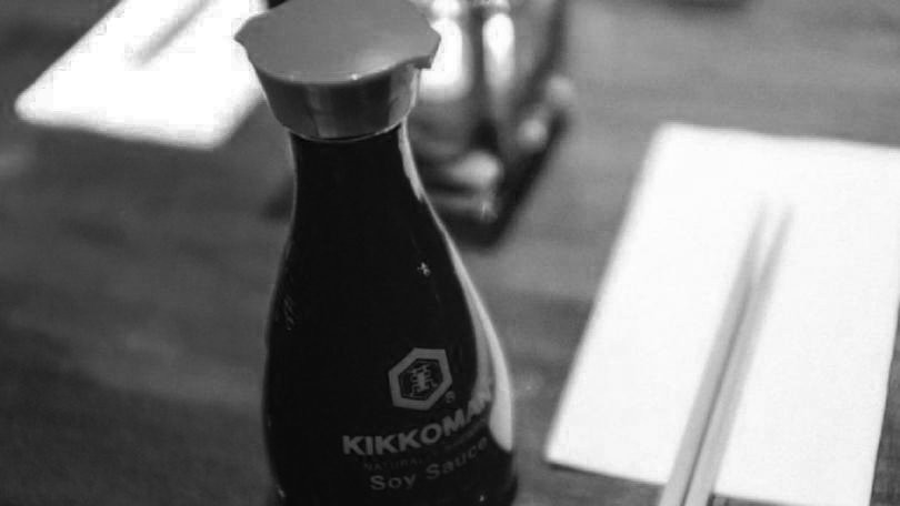
Kikkoman Designer Bottle designed by Kenji Ekuan


ON THE SHELVES
There is the only black color of the soy sauce and transparent material (glass and PETG) on the shelves and many brands use Kikkoman bottle design language since Kikkoman bottle became iconic
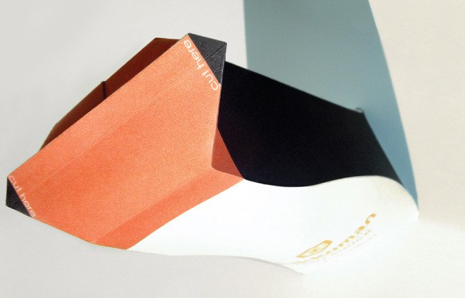
THE DESIGN CONCEPT
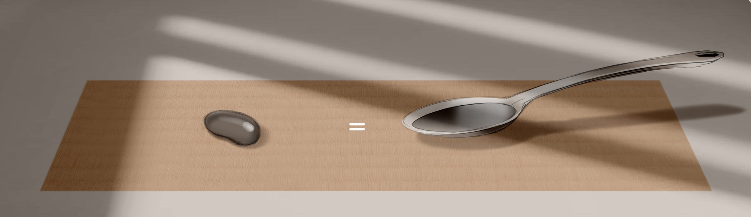
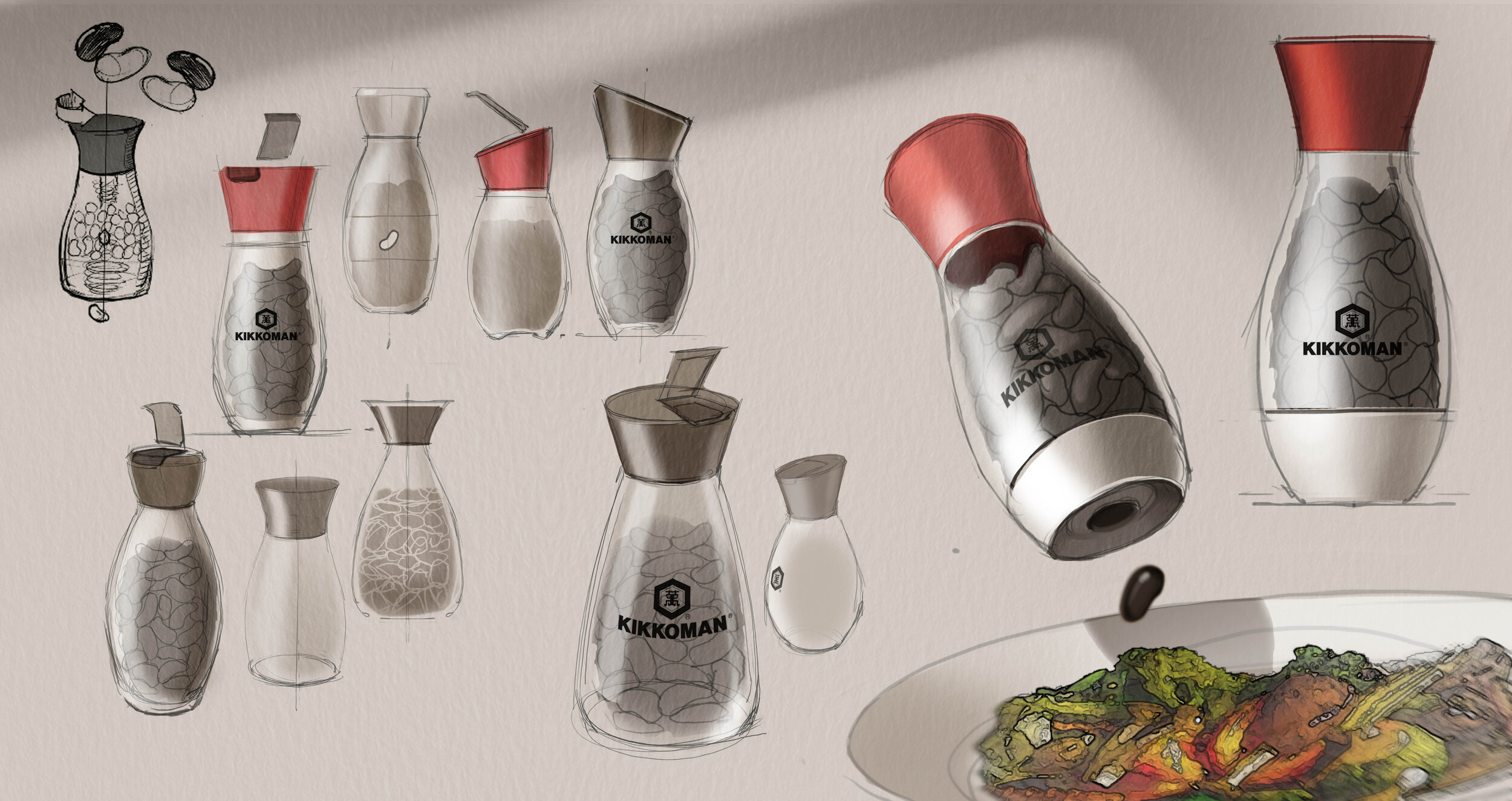
DIRECTION A : JELLY BEAN INSPIRED
What if we can make soy sauce become like jelly beans, and each bean equals one teaspoon so that consumers do not have to guess the amount of soy sauce when used?

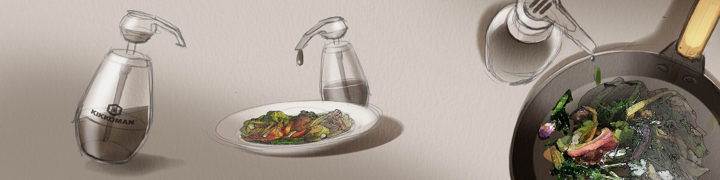
DIRECTION B : EASY POUR
What if we can simplify the way to pour soy sauce such as without lifting the bottle or without flipping and shaking the bottle?

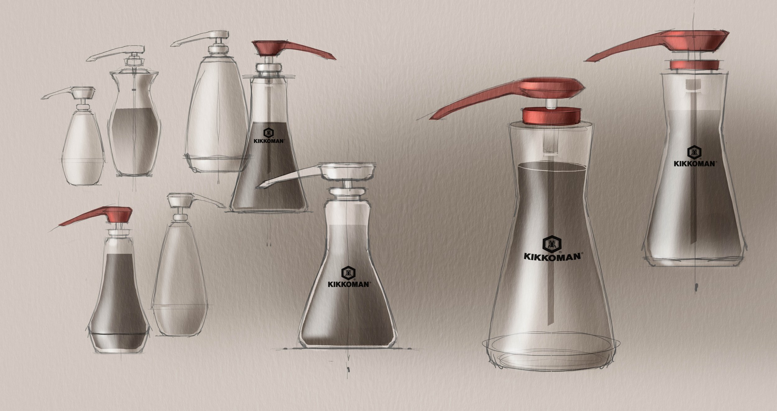
DIRECTION C : DIFFER FROM COMPETITORS
What if we can differentiate from other brands by using different materials and different colors?


"Design is a source of life enhancement"
— KenJi Ekuan
KIKKOMAN SOY SAUCE DISPENSER
-
User benefits
Easy disposable package
Deviate from conventional packaging
-
Client benefits
Stay ahead of competitors
reduce shipping cost
Increase brand loyalty
-
Social benefits
Reduce energy consumption on shipping
Recyclable material